

July 29, 2010
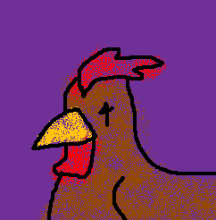
 This chicken has started to fade away as time passed. Still he stands tall and stays strong. He will keep fighting with his life. He will stand tall and hold the gate. I couldn't say what gate he's holding that he hasn't been relieved of his post.
Stay Strong
A Fan Made Robot
Hi there,
Seeing as how I’ve been both very bored and broke for the past week or so, I’ve been spending loads of time on the internets.
I found your blog a couple weeks ago and have been checking in every couple days to see what’s new.. I really appreciate your work.
So much so that I was inspired to create something of my own. Mind you, it has nothing to do with chickens, but like I said, I’m bored and broke, so I need cheap entertainment. This is my first real attempt at MS art..
I guess I’m just sending this because it was inspired by your chicken rainbow and nobody’s around right now for me to show it to.
His coat kinda came out pixilated.. I think that’s just because I was using fine lines. I wanted to put a flower on his lapel, but I’m not at that level yet. My idea for him was a timid kind of robot butler, or perhaps waiter at a classy establishment. Hmmm.. Anyways, enjoy!
Regards,
Mike
 Thank you Mike for showing me your first attempt, even if it isn't a chicken. And thank you for being a fan of mine. I know it's a bit rude but I'm going to pick at it.
First things first. Mike saved his robot butler as a BMP, which is good(unlike jpeg) but not web friendly. It's best to save as a PNG. As for the coat. There's nothing wrong with a bit of pixelation, but since you used gray for the outlines you probably should have colored the whole coat black(maybe with a red tie). I'm supportive of the fact that he had a simple idea behind him. He's a classy robot servant. It's a good base. I must say his slightly crooked grin makes him look a bit evil though. I actually rather like the floatation rings. Your biggest problem is the tophat.You have the band placed midway up but that goes at the brim, like so.(Sorry. that's rather abstract looking. This earlier rather terrible one may be better)
At any rate your robot looks about on the level of this robot. And I rather like ole batwings there.
Sorry about the lack of chicken this post. I'll have another up later today
Seeing as how I’ve been both very bored and broke for the past week or so, I’ve been spending loads of time on the internets.
I found your blog a couple weeks ago and have been checking in every couple days to see what’s new.. I really appreciate your work.
So much so that I was inspired to create something of my own. Mind you, it has nothing to do with chickens, but like I said, I’m bored and broke, so I need cheap entertainment. This is my first real attempt at MS art..
I guess I’m just sending this because it was inspired by your chicken rainbow and nobody’s around right now for me to show it to.
His coat kinda came out pixilated.. I think that’s just because I was using fine lines. I wanted to put a flower on his lapel, but I’m not at that level yet. My idea for him was a timid kind of robot butler, or perhaps waiter at a classy establishment. Hmmm.. Anyways, enjoy!
Regards,
Mike
Thank you Mike for showing me your first attempt, even if it isn't a chicken. And thank you for being a fan of mine. I know it's a bit rude but I'm going to pick at it.First things first. Mike saved his robot butler as a BMP, which is good(unlike jpeg) but not web friendly. It's best to save as a PNG. As for the coat. There's nothing wrong with a bit of pixelation, but since you used gray for the outlines you probably should have colored the whole coat black(maybe with a red tie). I'm supportive of the fact that he had a simple idea behind him. He's a classy robot servant. It's a good base. I must say his slightly crooked grin makes him look a bit evil though. I actually rather like the floatation rings. Your biggest problem is the tophat.You have the band placed midway up but that goes at the brim, like so.(Sorry. that's rather abstract looking. This earlier rather terrible one may be better)
At any rate your robot looks about on the level of this robot. And I rather like ole batwings there.
Sorry about the lack of chicken this post. I'll have another up later today
July 28, 2010
 A hard fighter who has survived dozens, if not hundreds of battles, clothed in only his lime-green scarf. His red eyes raging with blood lust. He will continue striding forward, undeterred by hardship. Those who face against him are against an unbeatable monster.
Also I apologize for wasting hours of your lives with the TVTropes links, but I need to mix up my pattern from time to time.
Battle Scarf

Also I apologize for wasting hours of your lives with the TVTropes links, but I need to mix up my pattern from time to time.
July 26, 2010
 This man is a ribbon of justice. Anyways I thought on what it would look like to draw a single stroke chicken since I haven't done something like that in quite a while. I feel this one gives a stark impression, like a logo off some fancy overpriced box of chocolate. The lack of a comb is regretful but I failed to realize until after I'd gotten too far in my stroke. I couldn't think of any simple way to insert it so it went without.
Erm. It's a bit over-sized and gets covered on the right I notice. Click it and you'll see the edge.
Ribbon
Erm. It's a bit over-sized and gets covered on the right I notice. Click it and you'll see the edge.
July 25, 2010
 Here we have a rainbow of chickens. Now I know you're gonna say something like "Why are there only six?" And the answer is Indigo and Violet are both Purple. Also when I look at an actual rainbow I can only see four colors(Red, Yellow, Green and Purple. I dunno what's up with my eyes...) So at any rate here we have six chickens displaying the 6 colors of light.(Red, Orange, Yellow, Green, Blue, Violet) On a vaguely sky background.
Chicken Rainbow

July 24, 2010
 Chicken on 7 is a piece that focuses on rainbows. I really don't have much to say for it. It's a basic chicken on a rainbow circle. I didn't really pull anything out so it's very basic. Just a chicken with some rainbow... *just got a great idea* I may well be back again tonight!
Chicken on 7

July 22, 2010
 This chicken is made entirely out of triangles. I thought it's be good for mixing things up a bit. It gives a distinct impression of sharpness, as such things usually do. Triangles are great for giving striking impressions of things. Also I like the disconnected neck. It makes his seem silly.
Also I notice that I've rolled back to my old update rate. Nice speed for that last while though.
Triangle

Also I notice that I've rolled back to my old update rate. Nice speed for that last while though.
July 20, 2010
 The robot on the top is named Flare. He was one of my first characters. He's a robot made by a scientist. He's powered by liquid fire. I regularly made him get upgrades and stuff. I love that guy. The right version is a modern update using my modern ability, but the left one is basically what I made back then.
And the bird on the bottom is M-Bird, who is a heavy chicken. That's how I intended him. I mean he was mostly a thrown weapon. Same as above on the updated version on the right. In the original I didn't really think of at all. I mean he had no waddle or comb even.
So yeah, this was mostly just me reminiscing about the character I made when I was a kid. You know I was like an 8 year old drawing comics in elementary school. I like Flare. He's still one of my favorites.
Flare And M-Bird

And the bird on the bottom is M-Bird, who is a heavy chicken. That's how I intended him. I mean he was mostly a thrown weapon. Same as above on the updated version on the right. In the original I didn't really think of at all. I mean he had no waddle or comb even.
So yeah, this was mostly just me reminiscing about the character I made when I was a kid. You know I was like an 8 year old drawing comics in elementary school. I like Flare. He's still one of my favorites.
July 18, 2010

I made a fan art of a site I rather enjoy.
At first I just scribbled up of of his blue people, but then I remembered that I only draw chickens so I and attached an artificial beak to his face with some string. You know, more or less standard operating procedure as far as this site is concerned.
Now, go read his silly blog.
Juz Fan Art (but still a chicken)
I made a fan art of a site I rather enjoy.
At first I just scribbled up of of his blue people, but then I remembered that I only draw chickens so I and attached an artificial beak to his face with some string. You know, more or less standard operating procedure as far as this site is concerned.
Now, go read his silly blog.
Rush Job

Here's one of my emergency back-up chickens. I only keep a few excess ones. You know borderline quality. Ones that I don't want to throw out, but don't like quite enough to post immediately.
I'll give you another good one soon. The first issue of my comic is almost finished, and that burned a lot of my drawing energy.
July 17, 2010
 This chicken has a striking presence. It's like SHWAH! So there wasn't really any way to refuse him.
I'm sure your curious as to why it's just the head and I have a perfectly cromulent reason for that. I couldn't make a body that fit with the head. It was a real bummer
Striking Chicken

I'm sure your curious as to why it's just the head and I have a perfectly cromulent reason for that. I couldn't make a body that fit with the head. It was a real bummer
July 16, 2010
 Well, this is a practice Chicken. I know what you're thinking. Practice Chicken? All you do is draw chickens. why do you need practice?
The answer is simple. I didn't use MS Paint to make this one. I made it in Puppy Linux (as opposed to Windows Vista) using a program called MTPaint. I don't expect this to become a regular thing, but I figured I may as well break it in.
Also I keep typing Pravtice instead of Practice.
Practice Chicken

The answer is simple. I didn't use MS Paint to make this one. I made it in Puppy Linux (as opposed to Windows Vista) using a program called MTPaint. I don't expect this to become a regular thing, but I figured I may as well break it in.
Also I keep typing Pravtice instead of Practice.
July 13, 2010
 A lawyer at the top of his career. When a case turns toward the dumps he's offered a shining proposal. But is he willing to fall to temptation and abandon his hard fought principles that have gotten him this far? Will he take this offer and throw the man he's defending to the dogs? Or will he stick to his principles and resist the cruel fate they're trying to leave his client with?
Shining Proposal

July 12, 2010
Same Chicken Post #6 (Sprite, Spray Style)
Dunno how I managed to forget this first one...
 Ah yes. Working pixel by pixel like I did in my very first chicken. It was refreshing to roll back to it. That said it works exactly like I said. I take the smallest brush, a single pixel, and make the outline for my chicken. After that I dump in the inside. In this case I then resized it to 4x the original size and shifted it a bit in order to keep with the sizing requirements I put on myself for this project. The zoom made it look pretty tacky but I think it worked well enough. He's basically a Sprite, like in an old computer game.

This is a sprayed up one. I half-ass the outline, copy it, spray it in with the spray can tool, and then I paste the outline back on top of it. That's really pretty much it. It gives a different effect than my usual hard dumping of colors. It feels more handmade and natural. I think of it as my Spray Style.
This is a sprayed up one. I half-ass the outline, copy it, spray it in with the spray can tool, and then I paste the outline back on top of it. That's really pretty much it. It gives a different effect than my usual hard dumping of colors. It feels more handmade and natural. I think of it as my Spray Style.
Brand New Sprite
Spray Down

July 11, 2010

Well I decided to try out something along the lines of cubism. Not actual cubism, but I liked the basic notion of cutting something up then putting it back together. After a bit of thought I decided to apply the ideas to one of my older works rather than making a new chicken to work off of. And so for simplicity I took the original picture and made a recolored copy then I started grabbing bits of each and put them together until I had a whole chicken. Looking at it it's a bit surrealistic, but I suppose that's rather the point is it.I'm glad I didn't think it through or I'd have gotten a much more boring picture.
Also, you person who unfollowed me, why don'cha come back?
Faded Ink Slice

Well I decided to try out something along the lines of cubism. Not actual cubism, but I liked the basic notion of cutting something up then putting it back together. After a bit of thought I decided to apply the ideas to one of my older works rather than making a new chicken to work off of. And so for simplicity I took the original picture and made a recolored copy then I started grabbing bits of each and put them together until I had a whole chicken. Looking at it it's a bit surrealistic, but I suppose that's rather the point is it.I'm glad I didn't think it through or I'd have gotten a much more boring picture.
Also, you person who unfollowed me, why don'cha come back?


July 10, 2010
 Here we have my Photoshopped Style. It's not really something I use much. The antialiasing bothers my eyes a bit so I tend to avoid using it. Plus it makes me lazy. There's really not much to say about it. This is just my Basic style really, only I use Photoshop to make it. The eye was hard to color and I ended up having to brush it in instead of dumping. Normally I' have taken advantage of it being photoshop and applied a nifty effect(like charcoal sketch) but not as part of this series.
---
I can't think of any other styles I use so this is the end of the project for now. If you can then I would appreciate you linking me to an example of it(or just mentioning it) in a comment on this post. But until another one comes up this series is Currently Complete.
Same Chicken Post #5 (Photoshopped)

---
I can't think of any other styles I use so this is the end of the project for now. If you can then I would appreciate you linking me to an example of it(or just mentioning it) in a comment on this post. But until another one comes up this series is Currently Complete.
July 09, 2010

That was one of them rap jams, just say it while you lay down some phat beats and pump it out. Or you know. Maybe it was just a crappy poem
Blue Tips

Well this guy's kinda a brat,
but he got a lot of money and he thinks he's all dat
Really all his tricks are just old hat.
Tipped his wing in blue, how about that?
BAM! He takes you to the mat!
Shows you what he does to all those cool cats
Who act like he's just a rat.
A Chicken, yeah but he ain't gonna take that tit for tat!
That was one of them rap jams, just say it while you lay down some phat beats and pump it out. Or you know. Maybe it was just a crappy poem
July 08, 2010
 This is my Layered Style. I just keep on piling patterns behind patterns until it looks complicated. You see, nice simple basic style. Really the first step is to construct the basic chicken, using the basic method. After that I just have to start drawing patterns and pasting the image back over it. Really I apply that method to a lot of things, but this style was where I used it in the first place. It was a key step in the development of my style and so I keep the Layered Style in mind as something I need to remember. Also it's fun working with it.
 Yeah, my Blue Period. That brings back memories of when I randomly declared it my blue period and did everything in blue for a few days. I even blued up the purple background of this one. As far as my style goes this could be more appropriately called my monochrome style but all my practice in that sort of look has been in blue(or gray in a few cases) so you know. Anyways the wide variety of shades combine together to give a look that is relatively reserved.
On a side note I figured out why I can pump these out like this. It's because I don't have to try to think of what to make. I mean I don't need to decide it's gonna be a cowboy cop on the wrong side of the law or something... I'll make that later.
Same Chicken Post #4 (Layered Style, Blue Period)


On a side note I figured out why I can pump these out like this. It's because I don't have to try to think of what to make. I mean I don't need to decide it's gonna be a cowboy cop on the wrong side of the law or something... I'll make that later.
July 07, 2010
 Well, I've got a video here with the good old song of the alphabet. It's all timed up with the Alphabet of Chicken that was recently finished. This is the final stage of that project. Bon Voyage alphabet. Soon this site will set sail toward a new destination, not that I know what that is. Until I know where I'm going all I can do is race blindly forward!
https://www.youtube.com/watch?v=I56TkzjMcgg
Alphabet of Chicken Video

https://www.youtube.com/watch?v=I56TkzjMcgg
Z.

Z! The final letter finally arrives in all of it's striking beauty. The sharp points bring out their full force against you. The chicken casually peeks out from behind it, haughtily mocking you! Are you just going to accept that!? Probably yes. After all that chicken's hiding out behind that stylish Z.
For those of you who are curious as to why this isn't the end of the Alphabet of Chicken project my answer is this... El-em-En-Oh never sounded like one letter and I'd never know how to draw it anyways.
July 06, 2010
 Compared to W. and X. this one seems dull and uninteresting. For that I'm sorry. Still I like the way the Y. turned out. The chicken watches the dark Y fade behind him as he strides out facing forward to his new life. By which I mean the new life that will be breathed into this site once the alphabet is done.
Now, I know you're thinking "Just the one letter left, huh?" Well, yes, but not just that. I'll provide more details in the post for Z.(or possible not)
Y.

Now, I know you're thinking "Just the one letter left, huh?" Well, yes, but not just that. I'll provide more details in the post for Z.(or possible not)
X.

Same Chicken Post #3 (Rounder And Cuter Style, Borderless Style, Silhouette)

Yeah, this one might not count as a style I use. I mean I've only drawn two so far, and one of them was just a bit ago. Still it was my intention from the start to use it from time to time. After all there's always room for a cuter cuddlier version of things from time to time, isn't there? Anyways to explain the basic style. First everything is rounded, plus I made the outline using the large circle brush, instead of the middle one. I like the nice round eyes, though those were a newer decision. Lastly I shaded it lightly with a lighter version of the color thinly on one edge. Plush. Plush... Plush isn't a sound effect is it?


July 05, 2010
 Here is W. It's actually a lot smaller than the other letters in my series of letters. I'm not really sure when I started thinking of W as being 2 parts. I mean I do, but yeah.I like that little interlocking thing I've got going on with it. I probably should've made the outside edges jut out some, but I lost track of the size and thought it was big until I finished and realized it was relatively tiny.
W.

July 04, 2010
 Well, at this time last year I ended up finding a picture of fireworks on Google and editing it up in Photoshop. This year I felt confident enough to do the fireworks freehand. I think they look pretty good, especially the green one, which looks like a flower to me for some reason.
For those of you outside the US, who didn't pick up any of our culture from the hit films, I'm American and this is Independence Day. We celebrate it with festive fireworks.
This post was a scheduled post so I decided to put it up at 7:04 AM, since 7/04 is July 4th.
Firework Day!

For those of you outside the US, who didn't pick up any of our culture from the hit films, I'm American and this is Independence Day. We celebrate it with festive fireworks.
This post was a scheduled post so I decided to put it up at 7:04 AM, since 7/04 is July 4th.
July 03, 2010
 Now, I know what you're thinking. Whoa whoa whoa. The Chicken Man is postin' up FOUR things today!? That guy barely even posts one thing a day. This is true but I don't care.
This is Doctor Round. he's the refinement of my Rounder And Cuter Style. I think I made some nice cute eyes for him. You know, the weakness of the original Rounder And Cuter. And you know he's got a stethoscope since he's a Doctor.
Doc Round

This is Doctor Round. he's the refinement of my Rounder And Cuter Style. I think I made some nice cute eyes for him. You know, the weakness of the original Rounder And Cuter. And you know he's got a stethoscope since he's a Doctor.
Normal Human Person

Same Chicken Post #2 (Gritty Sharpness)

Slugger

Anyways I gave this guy a heavy set, wider than my usual style. You know, since he's a tough guy who can knock the ball right outta the park. His uniform is blue, because it didn't look match up with any of his other colors. The 'C' on his hat is, of course, for Chickens.
July 02, 2010
Same Chicken - Post #1 (BCM Style, ACM Style, Abstract)
Well, I'm starting a new project. One that's less 'sophisticated' and 'story having' than the others. In this project I will explore the range of my styles by remaking the exact same chicken a while bunch of times. The chicken will be brown(if color is involved), facing left, the top of the wing visible, on a purple backdrop, with the size 242x246. Using these basic attributes I will demonstrate my artistic range of making chickens in MS Paint. I'm starting it off with three, since otherwise it would just be one chicken and not a very interesting one.
 Well, I suppose it's rather obvious that I'll be opening this project with the 'Basic Chicken Maker Style,' as I've come to think of it. The basic style I apply is to make an outline, using the middle round brush in paint, with vague shapes for the details, such as the beak, wattle and comb. Following that I dump in colors using the paint bucket tool. I'll be honest with you. My basic style is very simple and easy to do. That's why it's the basic style.
 And I'm following up on explaining the basic style with the 'Advanced Chicken Maker Style.' These tend to be more striking, with a sharper more compact appearance. I still tend toward the middle round brush while working on these. The key difference though is in the nature of the coloring. While my first step is still to dump it full of colors I follow that up with using advanced methods to shade along the edges. (The advanced method involves cutting and pasting with different colors being transparent in case you're curious)
 This isn't really one of my usual styles. I've only thrown together a few 'Abstract' chickens. I stick to what I said on the original. Abstract art is the kind of art you make when you wanna do art without actually working on the details. You just toss it together quickly leaving an impression of whatever you're designing without thinking about it too much. If you're lucky it'll look nice in the end. Yes, I know that abstract art is hard to do. You need to ignore everything you've learned in order to draw out of your usual style.


July 01, 2010
 Well, I've refined the character design for my comic character. A bit simplified. Yeah, I know I gave him some funny looking feet, but they're easy to do consistently. Also, the comic'll be in black and white(and grays). It looks nice and it's easier to make nice looking Black and White than to make nice looking color. You have to do a lot of shading work to improve the style of color. Color covers though. And my plan is to release this in chapters instead of pages like most web comics do. So, I need an opinion. Should I do all of the thumbnails going down the page or should I do a list of links or should I do something fancier? I'm not sure how that last one works but you know.
Also I killed the link within somehow, but whatever that thing was kinda stupid anyways.
Hero Black/White

Also I killed the link within somehow, but whatever that thing was kinda stupid anyways.


